
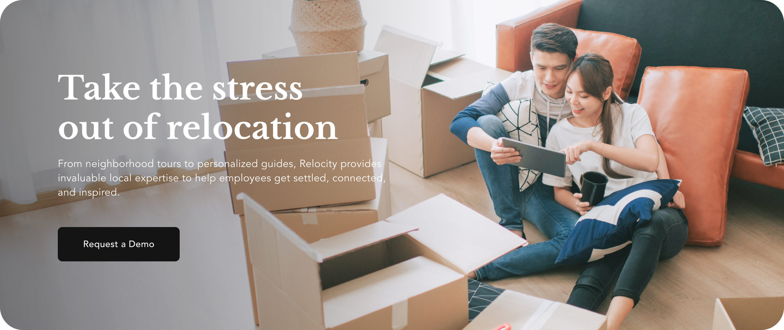
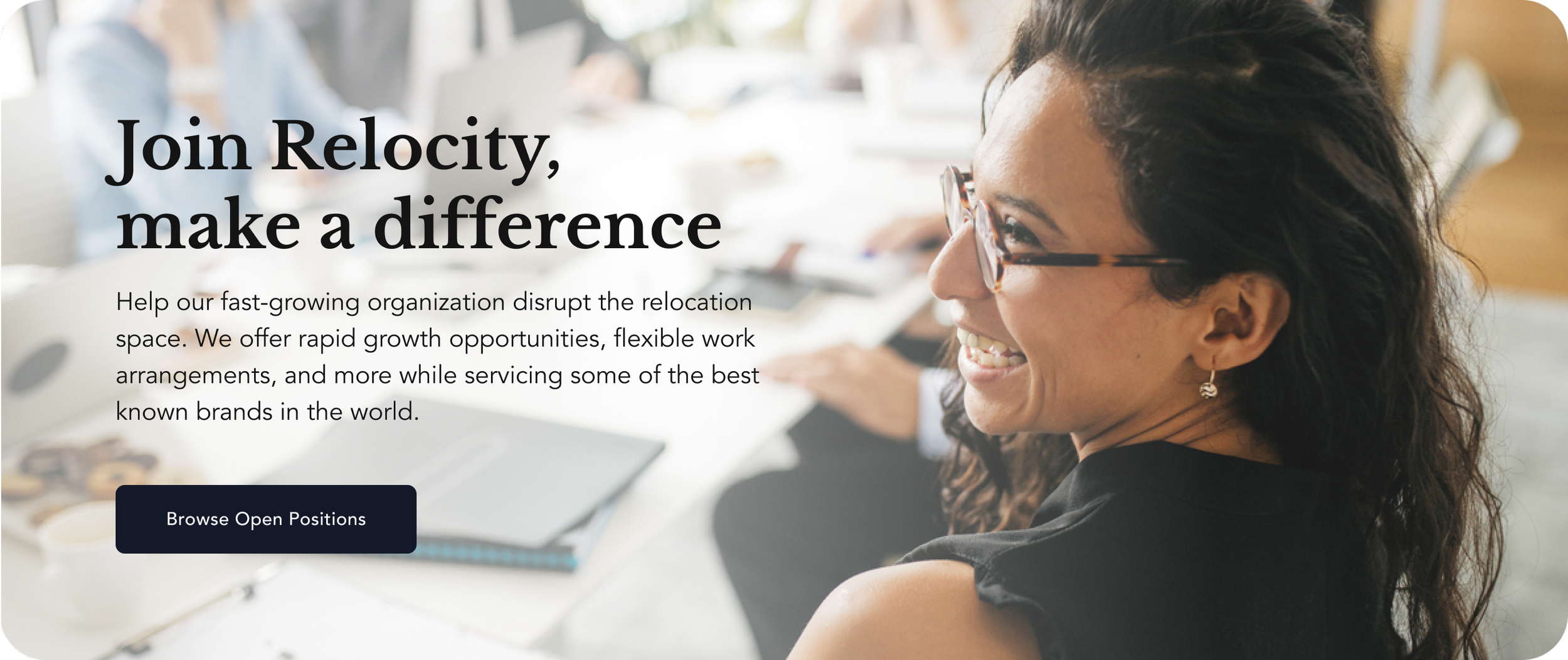
My task was expanding the the look and feel of images based on the existing brand guidelines. Previously the brand was largely black and white, so I soften and enlivened the feel of the imagery with tints and tones of the brand colors. I also set the tone of the photography with soft lighting and a more mid-range value scale. Projects include video, website design, product design, presentation decks, social images for LinkedIn and Twitter including posts, banners, and other collateral.
This video was created to loop in the background of events. Since there would be in-person interactions near the TV, no sound was needed. The video features key market areas. Use of motion graphics and transitions using Relocity’s rounded diamond asset make this video on-brand.
Website hero images
The objectives were to show people using technology that facilitates an easy relocation experience.
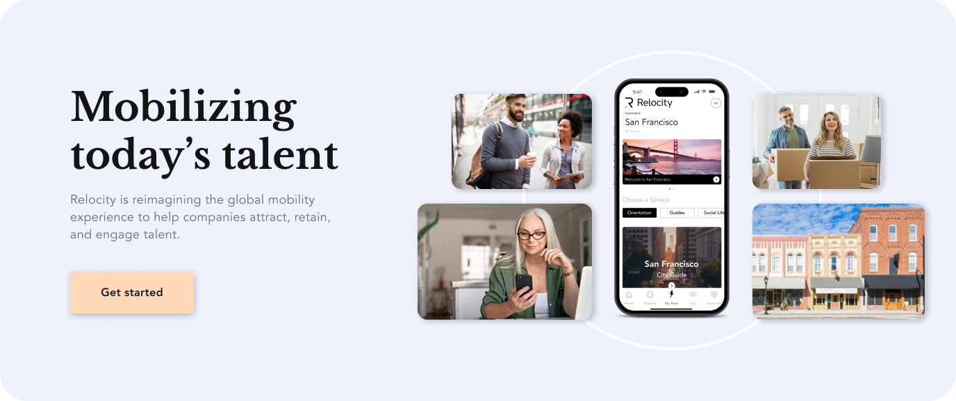
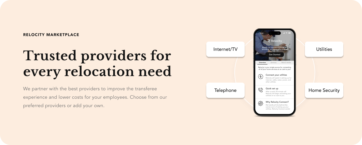
App design/UI
The map with the red overlap is what the company app currently looks like. It is meant to show traffic times from a common starting point. As this is hard to see, I was tasked with simplifying this map and making it easier on the eyes.

In-app map (before)

My version (after)
Email banners, social media, and infographics
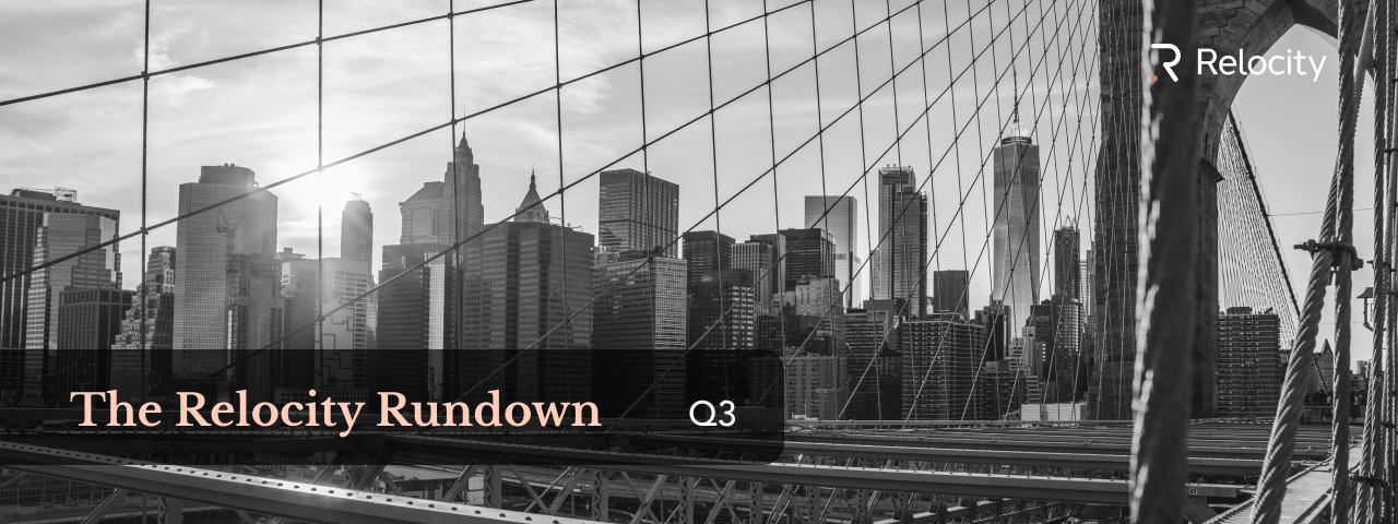
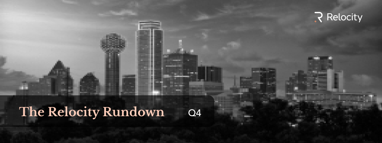
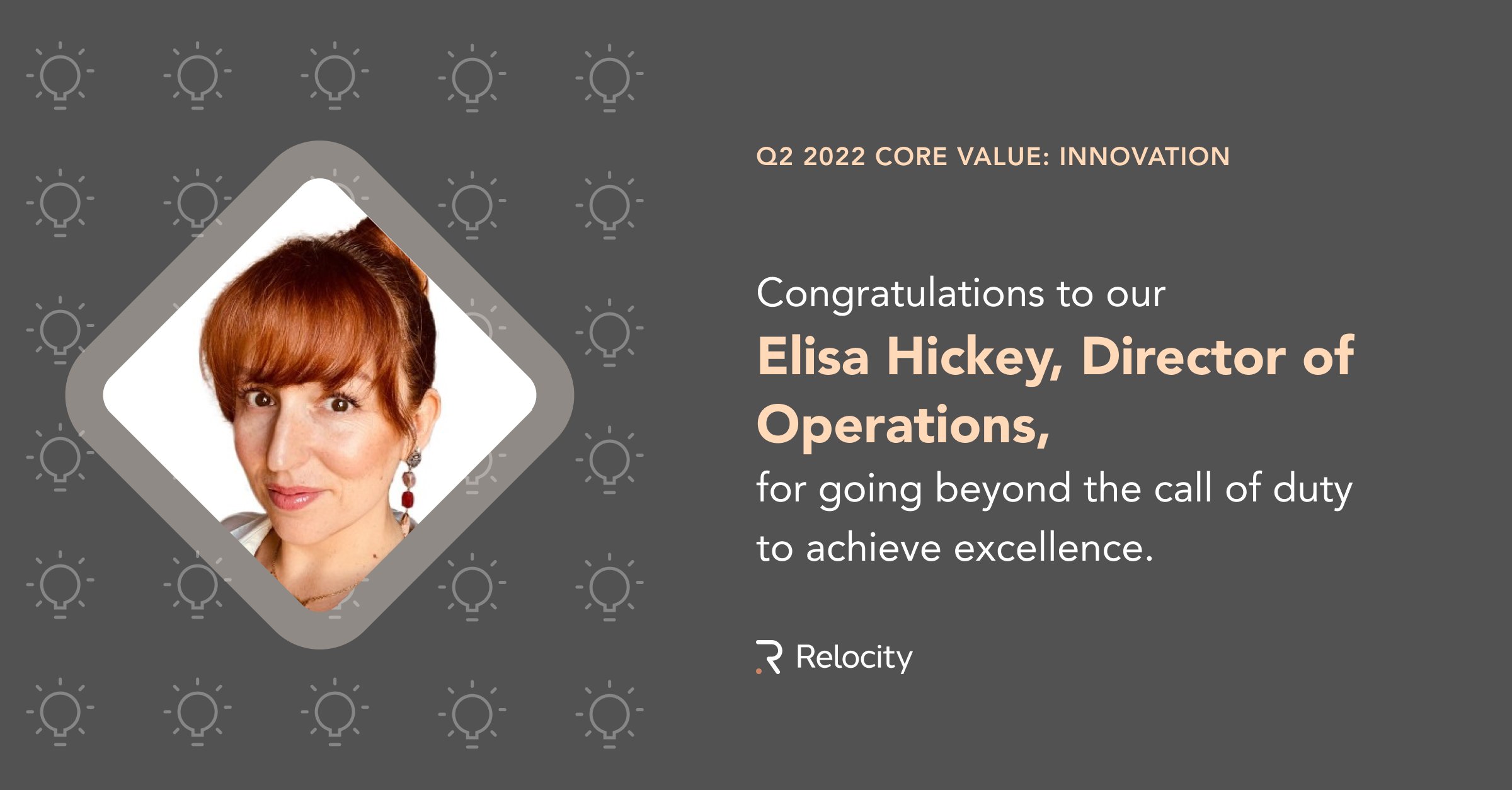
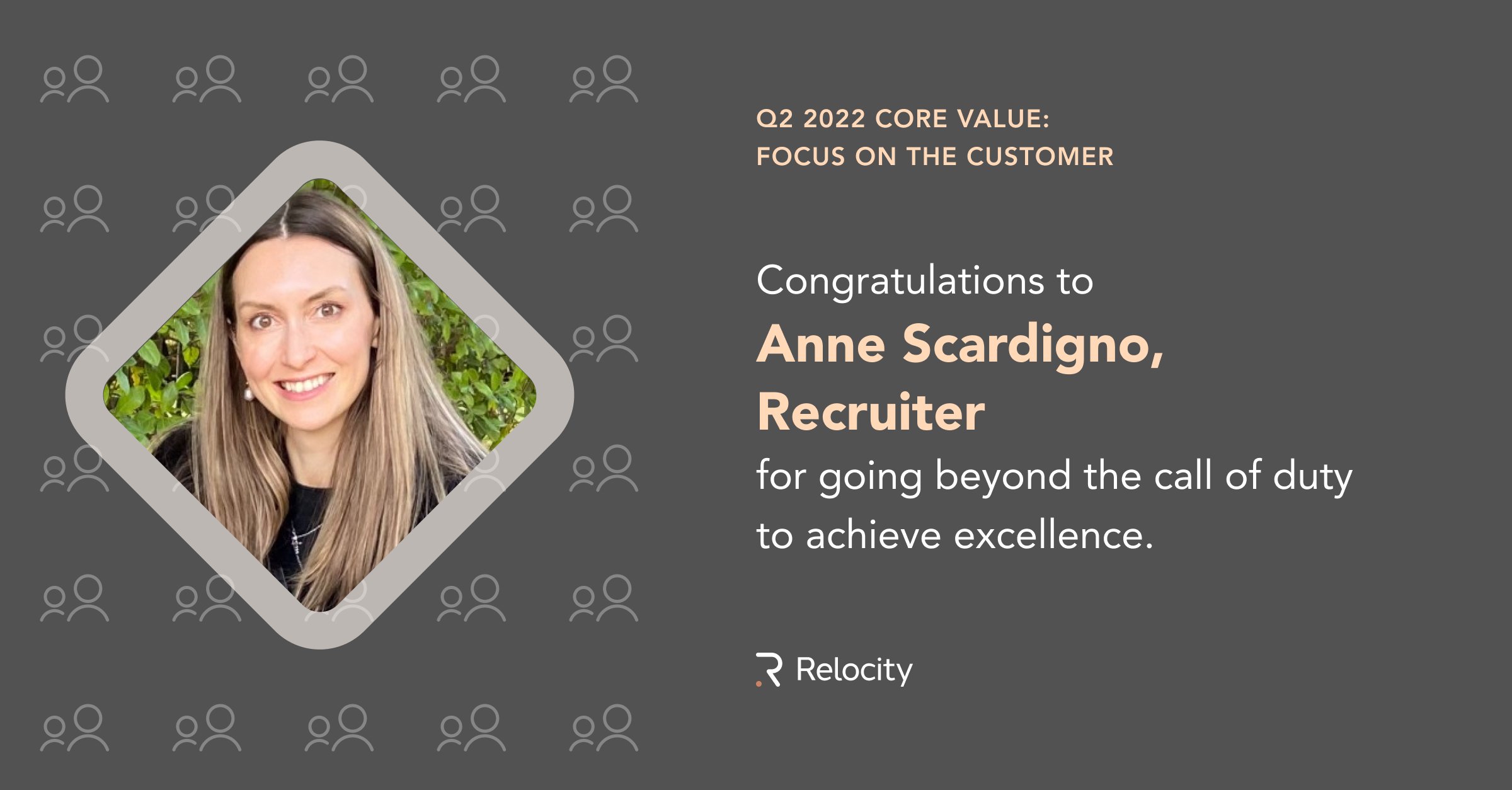
These email banners are for an internal newsletter running on a quarterly basis.


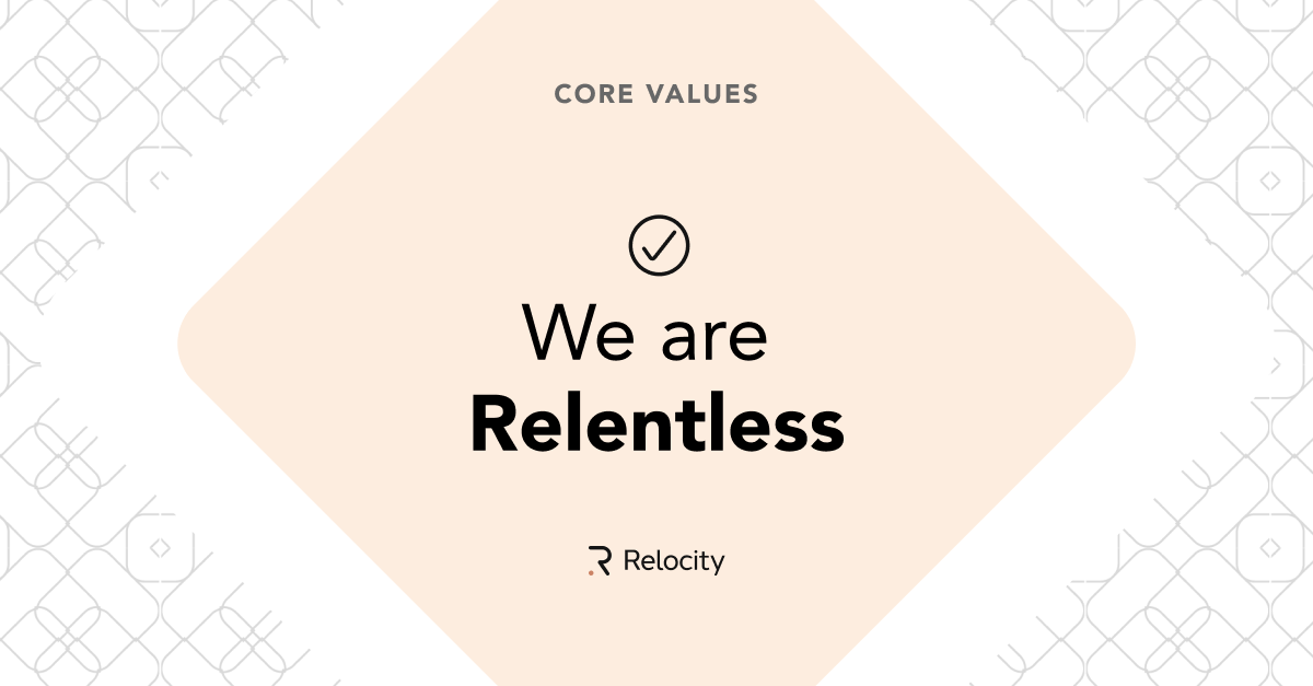
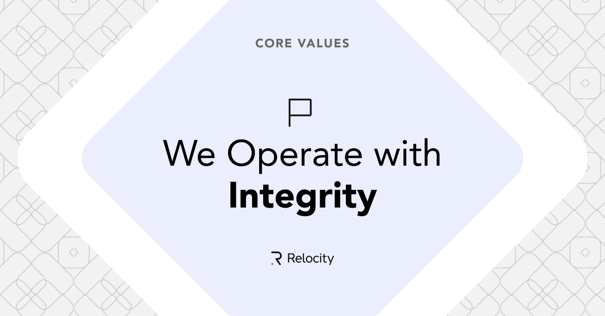
Expanding the scope of the brand through social media images.
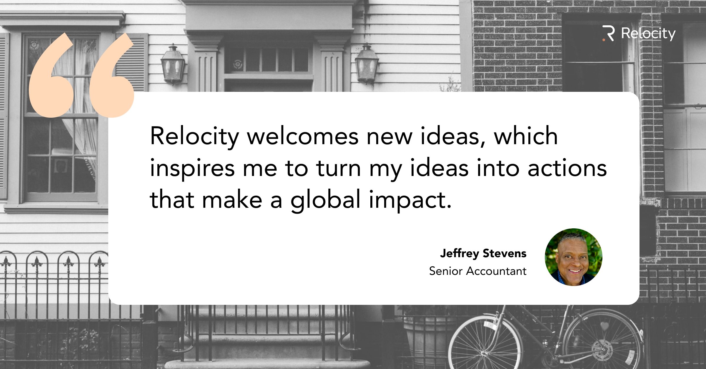
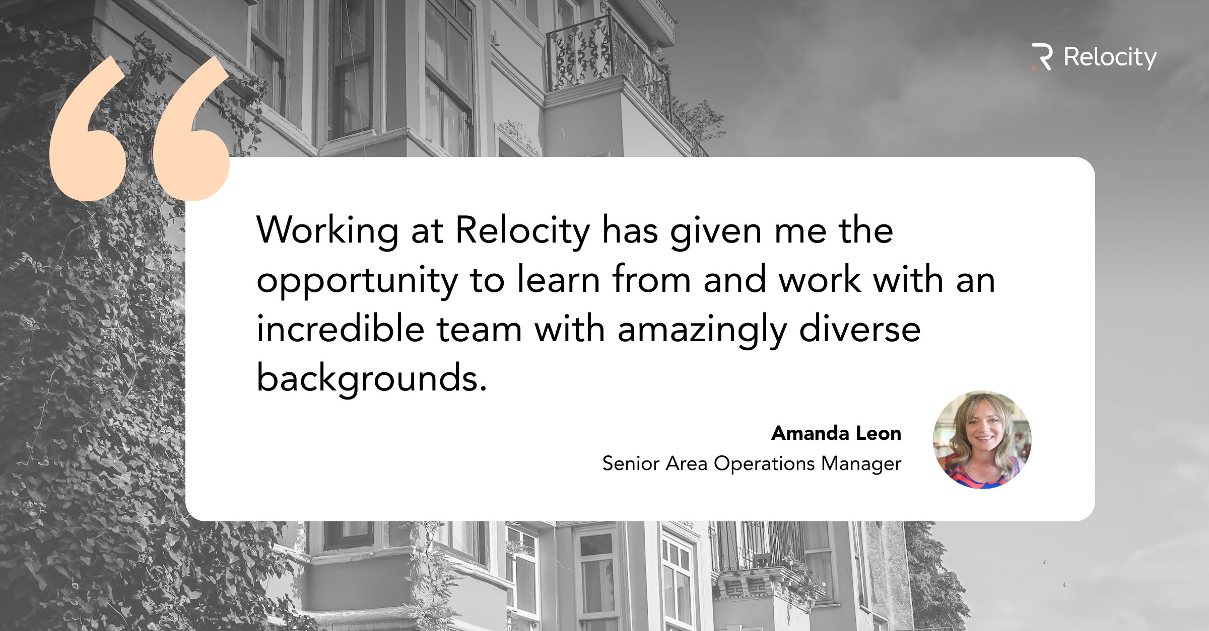
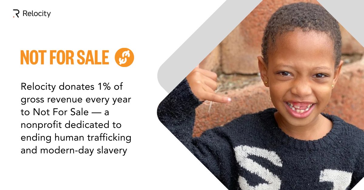
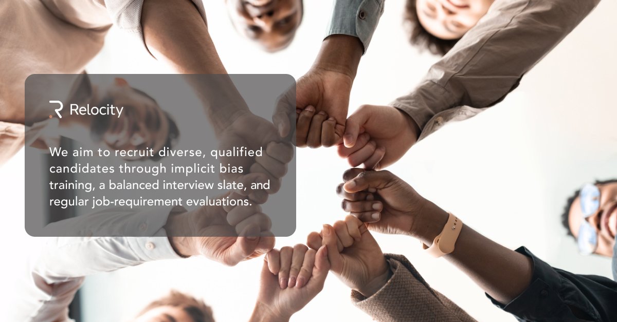
The banners below were created with the directive to make the brand more friendly. Previously, photos of people were not used as much, so showing people using technology and connecting remotely communicates the benefit of the company.


Infographic promoting remote-first work. The photo has a similar palette to the brand colors.
