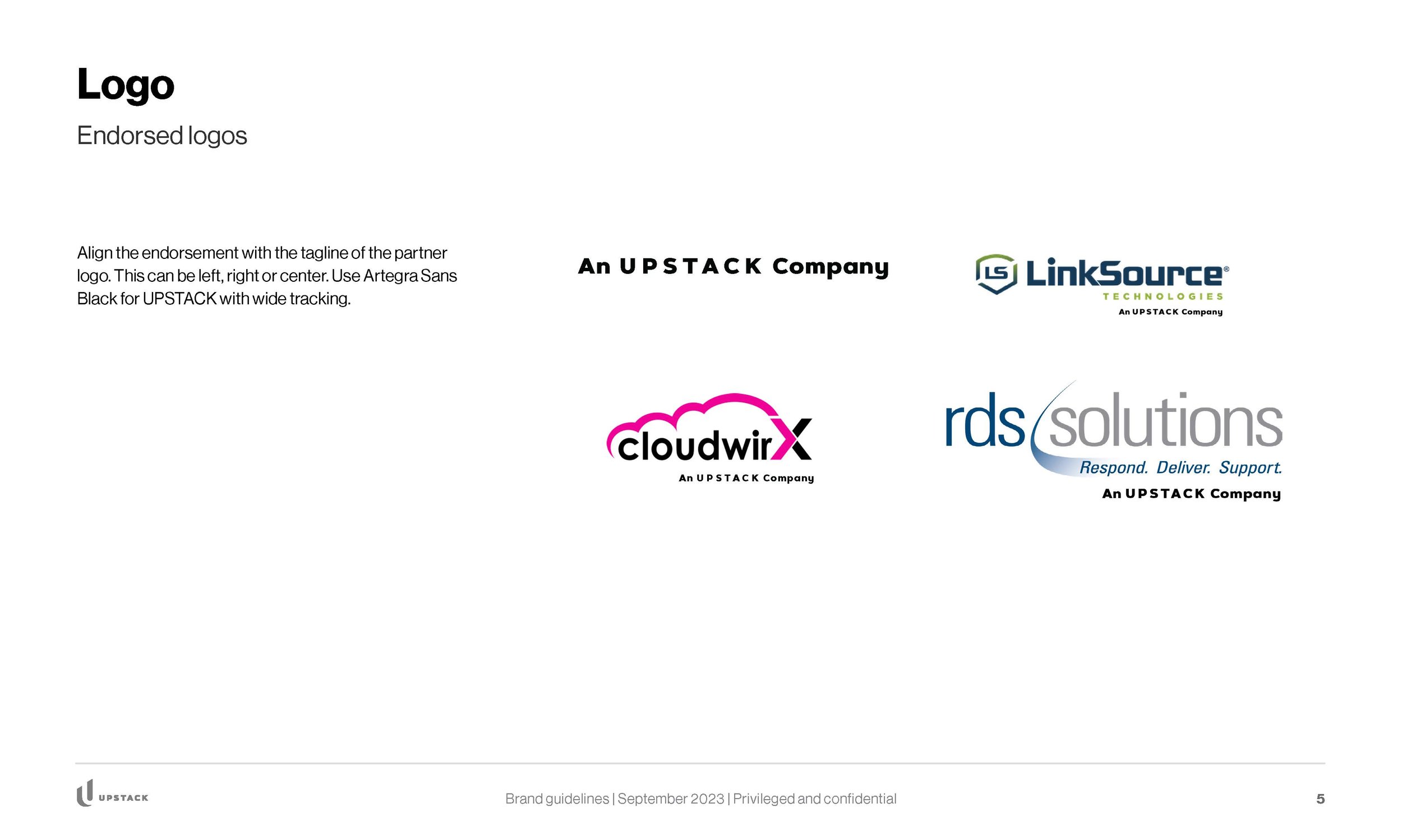
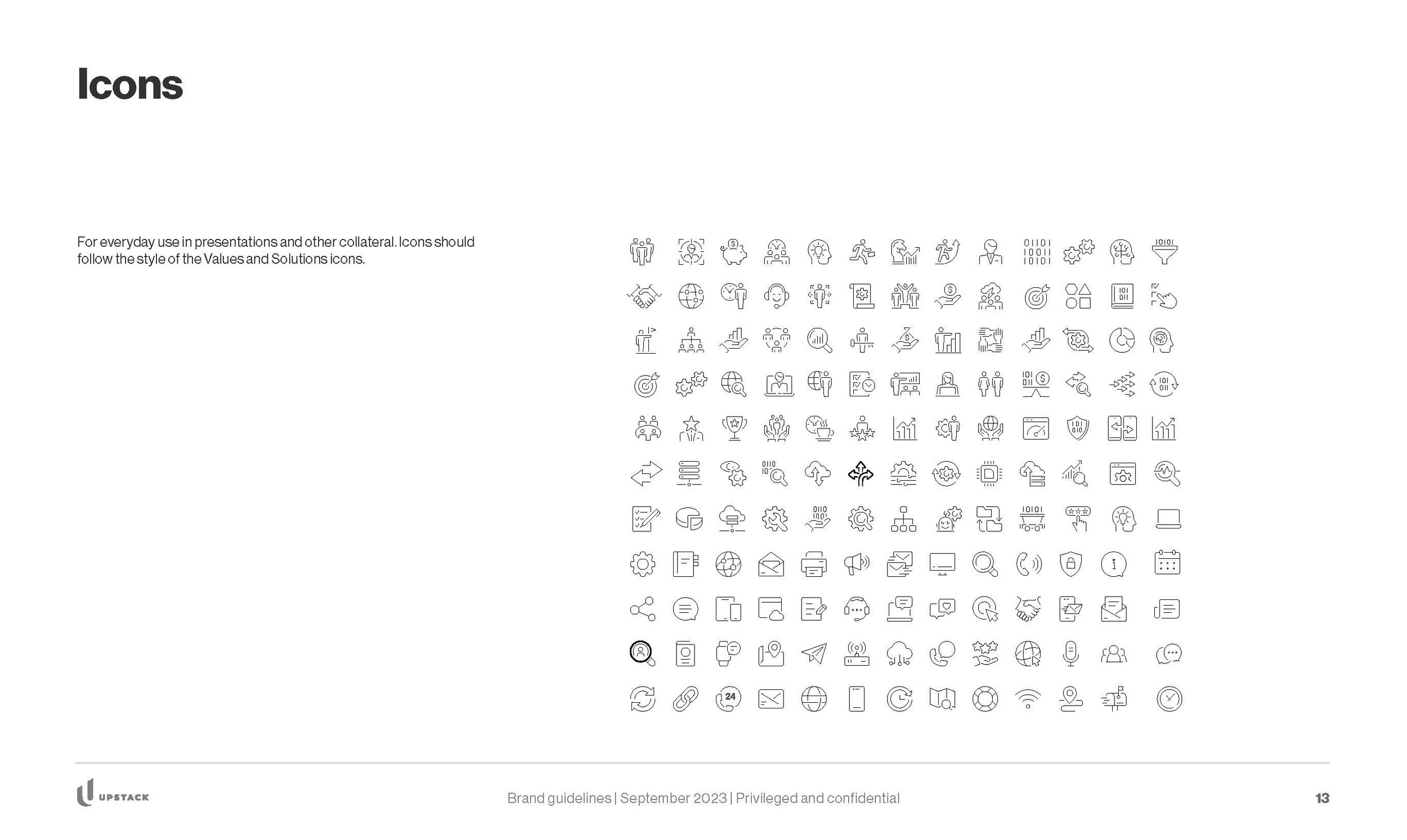
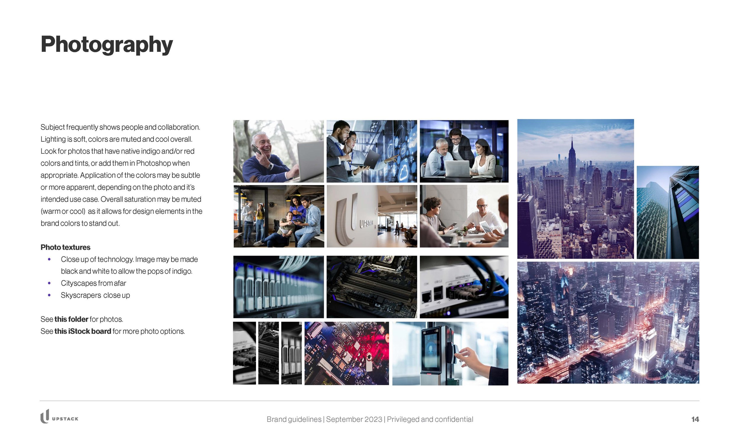
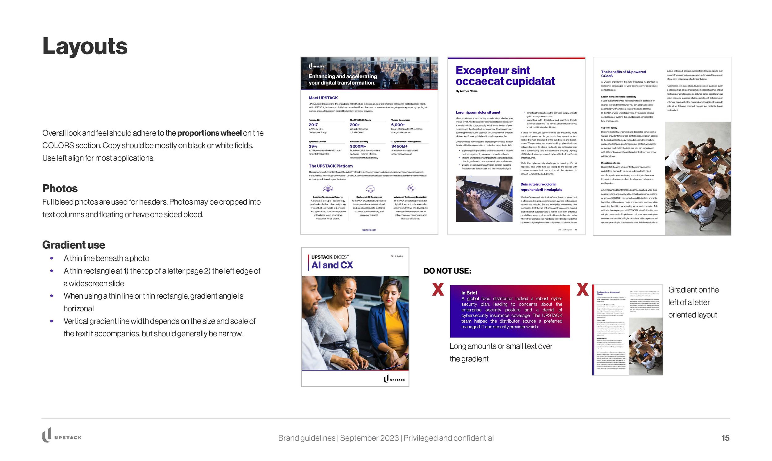
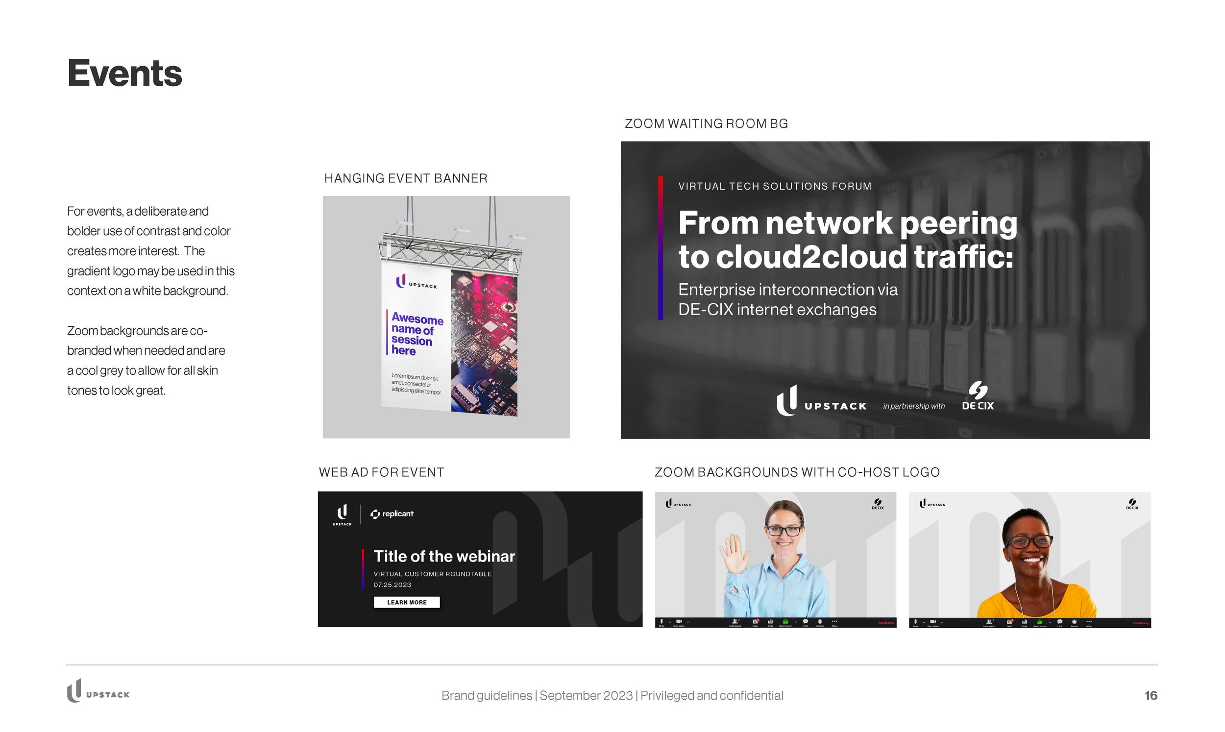
UPSTACK had a problem with consistent application of their branding. Because the organization was using disparate contractors, and reinventing their design standards every time, there was a visual disconnect in the look and feel of all their materials. The event collateral was particularly dissociated from the core brand. My solution was to refresh their brand style guide and show how to consistently apply official UPSTACK branding across multiple touch points and various media.
Brand Style Guide
Website and landing pages
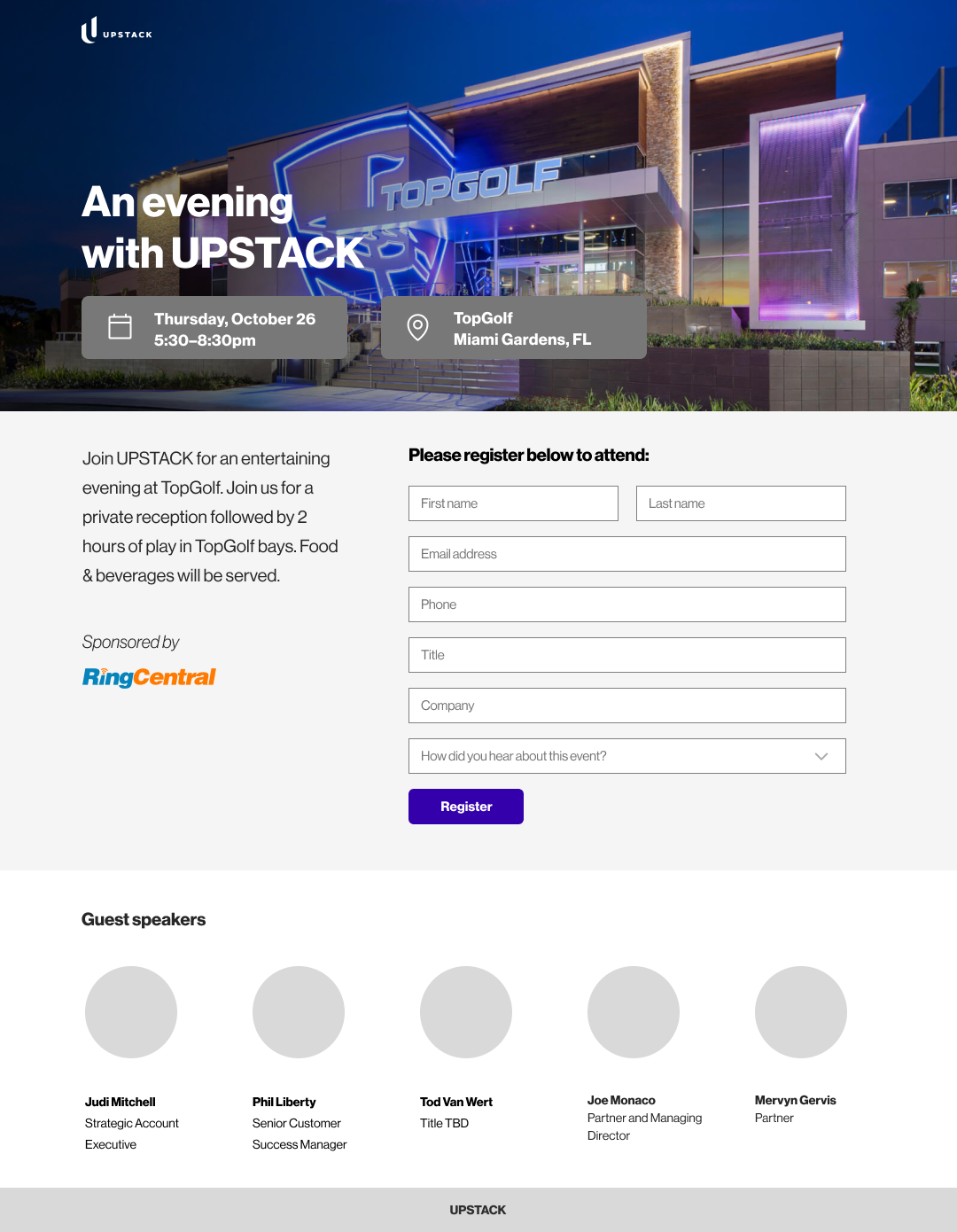
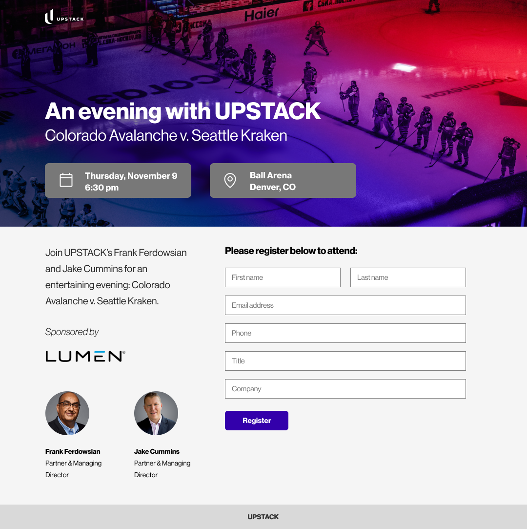
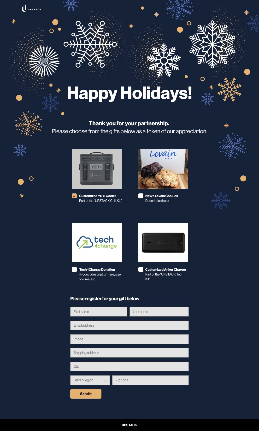
My redesign: while the client was attached to the hero image, it caused problems with reading the subtitle. The CTA button did not stand out there and elsewhere, so I made sure the contrast between the buttons and the background were higher. I also reduced the amount of garish use of the color gradient to adhere to the color proportions outlined in the style guide. Other design changes I made improve readability and accessibility, with a clean, minimal approach.

BEFORE: original website

AFTER: my design
Landing pages